Setting up NDVI colorbar can be tricky! You want a nice representation of the vegetation and bare surfaces in the map.
1. I found an easy way would be to flip the default matlab summer color bar upside down!
colormap('summer')
map2 = (colormap);
map2 = flipud(map2);
colormap(map2);
cmap = colormap;
It looks like:
 However, the negatives are not treated nicely. For the first approximation, I could set x<0 == 0.
2. Found a nice one:
https://publiclab.org/notes/cfastie/08-26-2014/new-ndvi-colormap
The colorbar is nice, but, I was not much happy with the squeezed RBG dance!


3. Having seen them, I wanted to create my own.
I combined the inverted summer with the graded b/w scheme. The idea is to set inverted summer for x > 0 with the gray image for x < 0!
So, I wrote this small piece!
The new NDVI colorbar looks like:

The color scheme looks like:
 For the first half, it goes from dark to bright, and then smoothly to green from yellow at the center!
Try it! and let me know if you like this scheme for NDVI!
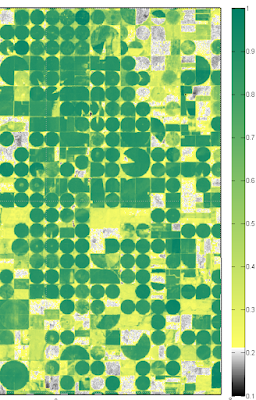
Here is a small preview. I changed the lower rgbb matrix to 224x3 arrays which nicely set yellow limit at ~0.2! (some info on NDVI for the cusious minds: http://earthobservatory.nasa.gov/Features/MeasuringVegetation/measuring_vegetation_2.php)
1. I found an easy way would be to flip the default matlab summer color bar upside down!
colormap('summer')
map2 = (colormap);
map2 = flipud(map2);
colormap(map2);
cmap = colormap;
It looks like:
2. Found a nice one:
https://publiclab.org/notes/cfastie/08-26-2014/new-ndvi-colormap
The colorbar is nice, but, I was not much happy with the squeezed RBG dance!

3. Having seen them, I wanted to create my own.
I combined the inverted summer with the graded b/w scheme. The idea is to set inverted summer for x > 0 with the gray image for x < 0!
So, I wrote this small piece!
r1 = [0 1];You can set that linspace limit to 128, and make 256x3 colormap, making a smooth colorbar.
g1 = [0 1];
b1 = [0 1];
rgb1 = [r1; g1; b1]';
rgbt = interp1([1 2],rgb1, linspace(1,2,32 ));
r1 = [ 1 0];
g1 = [1 0.5];
b1 = [0.4 0.4];
rgb2 = [r1; g1; b1]';
rgbb= interp1([1 2],rgb2, linspace(1,2,32 ));
newNDVI = [rgbt;rgbb];
figure
colormap(newNDVI );
cmap = colormap; % cmap nicely puts colormap into 3 col data
% colorbar
caxis([-1 1])
hc = colorbar('southoutside');
set(hc, 'FontSize', 16)
axis off; set(gcf,'Color','White')
The new NDVI colorbar looks like:
The color scheme looks like:

Try it! and let me know if you like this scheme for NDVI!
Here is a small preview. I changed the lower rgbb matrix to 224x3 arrays which nicely set yellow limit at ~0.2! (some info on NDVI for the cusious minds: http://earthobservatory.nasa.gov/Features/MeasuringVegetation/measuring_vegetation_2.php)


